
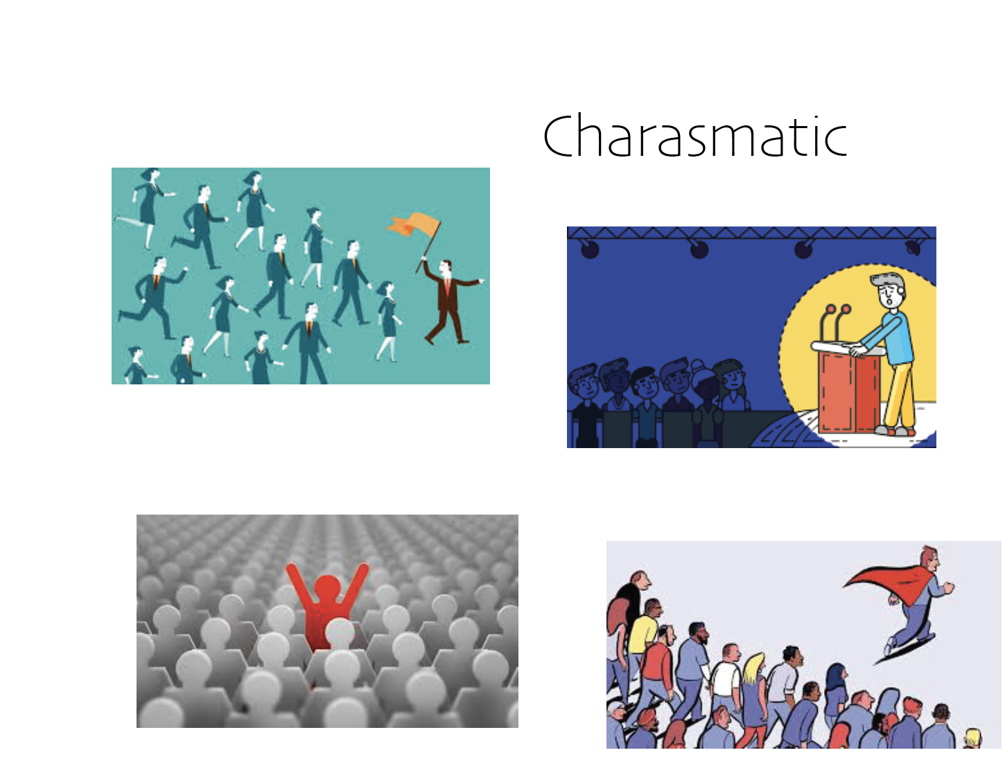
This logo of mine was created in Adobe Illustrator. This project was fun and challenging. It was fun to come up with different logos based on words that describe me. The words I chose for my mood boards were creative, tech=musician, diligent, and charismatic. These are words that I believe describe myself and how I work. I first started with the mood boards where images that suited the word were compiled onto a layer in illustrator.
After compiling the mood boards, it was time to create different logos based on each word. A lot of my time was spent thinking about what the logo should be before my pencil even met the paper. After I thought out my logos, I drew them on paper. I chose the word that I felt represented me the most for my final logo.
This word was the word musician. I have been a musician since 4th grade. Music is really important to me and represents a major part of my personality. As for my logo, I wanted to convey one of the symbols in music, but add a personalized twist. I chose the flat symbol. I chose this because it looks like a B which is my first initial but also because many of my favorite pieces contained multiple flats in the key signature. As for the staff part of the flat, I made it a guitar neck, because I play guitar. Cello was the first instrument I learned, but I have been more focused on the guitar more in the past few years.
I had a lot of fun with this project and I really like the product that came out of it. I feel that this logo could be used in several different aspects of the music business, which is the industry I'd like to work in one day. I'd love to create other alternatives to the flat logo with maybe different instruments or other symbols from music.
Colored Logos

Sketches


Your logo is so cute! I really like how you decided to make a logo out of your identity as a musician. Music is such a wide topic, but you were able to symbolize it well while also incorporating your specific experience with it. Your color palettes are nice and bright but you could try experimenting with the more neutral colors often seen on musical instruments. Great work!
ReplyDeleteYour logo is very creative while maintaining a simplistic look which I think will be effective in the future if you decide to use it, as well as for the business cards we will be creating. I like how you were able to implement aspects of yourself into it as well as the industry you want to work in. Your colored logos work really well too and you could even experiment with having more than one of the images together in different colors as one logo.
ReplyDeleteThis logo is super creative and fun. I love how you made you initial into something you love. I would have never thought to do something like this. I also really like the different color versions, they are sharp and eye-catching.
ReplyDeleteI think this is a very successful logo! It really captures your personality and interests in my opinion! It was super clever to have the "B" resemble a guitar and it definitely adds another personal element.
ReplyDelete